In-progress
Important Links
Background
As an interim step, the Global Search screen for phase 1 of the v2 app will largely be a UI refresh to match with the rest of the core UI updates. In a future iteration, we will look at how we can improve the search experience as a whole, since it is in need of more improvement.
Design
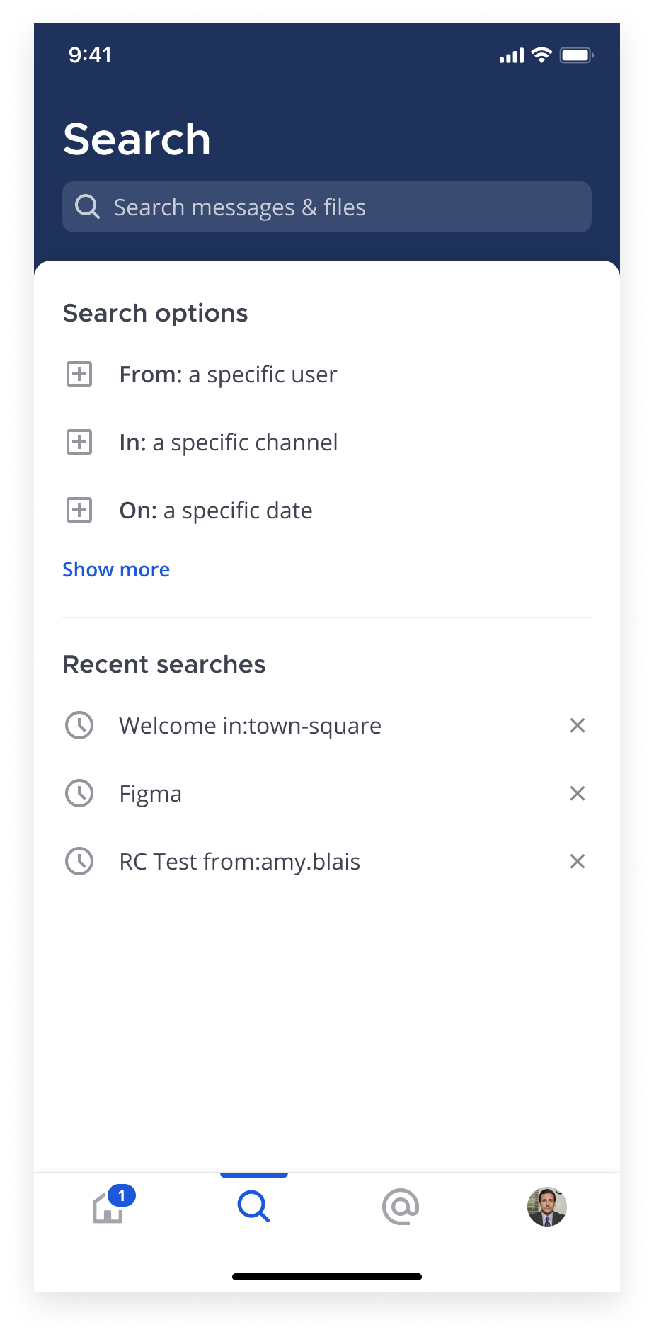
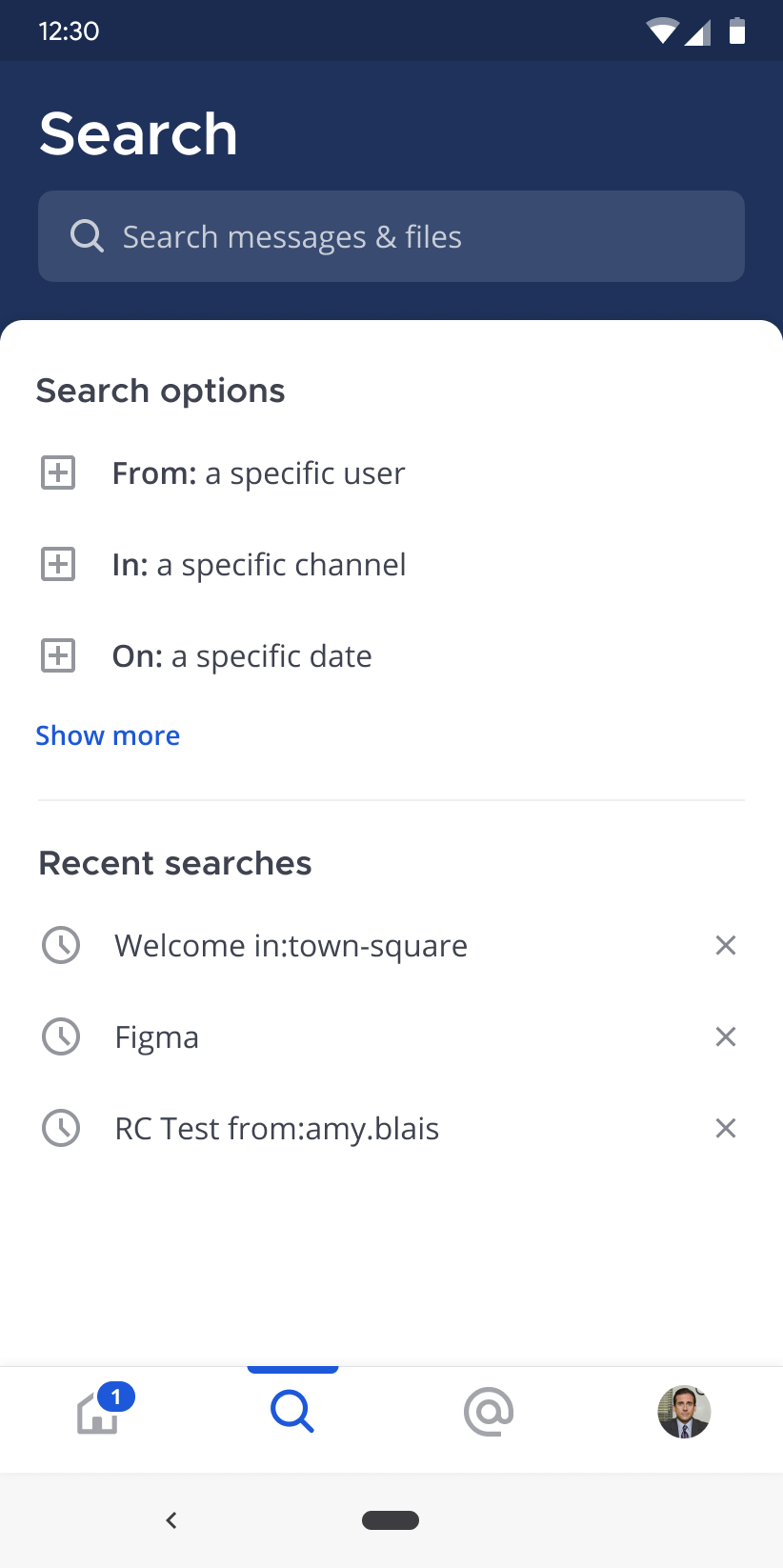
The Search Screen and the Recent Mentions Screen follow a very similar design pattern. The default state displays with the enlarged header and once users scroll within the main content area, the header condenses.
iOS
Android
States
Below are the many states this screen can be shown in.
Default
In the default state, the Search Input is not focused. Users can tap the recent searches or modifier items below to populate the search field.
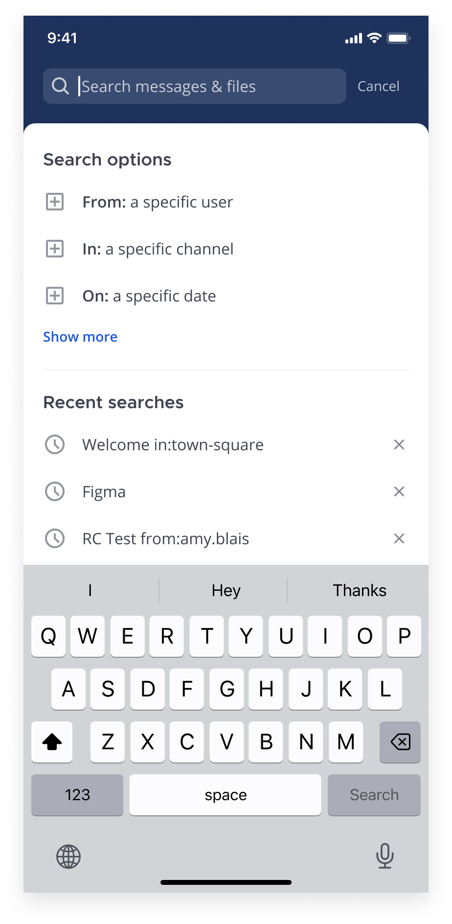
Focused, Text entered
When the input is tapped, the keyboard displays and the Cancel button shows next to the input. Once text is entered, the ‘Search’ button is enabled on the keyboard and the clear button is added to the search input field.
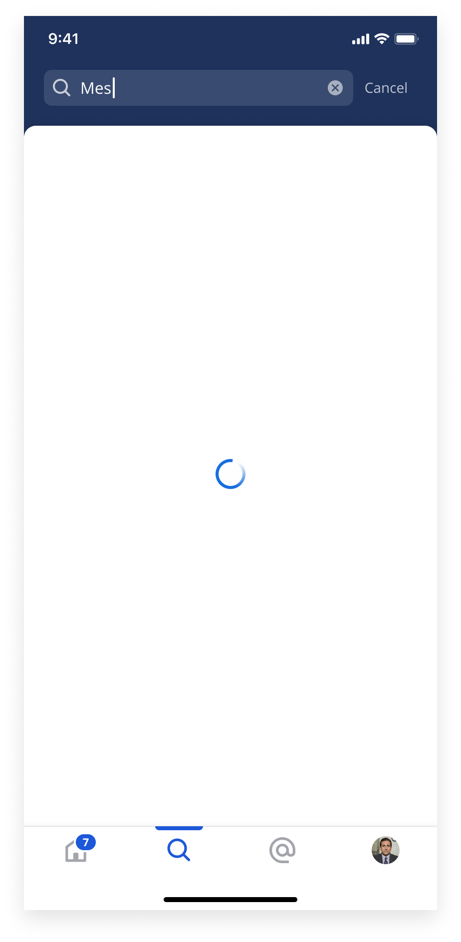
Loading
While searching for results, a spinner displays within ht e
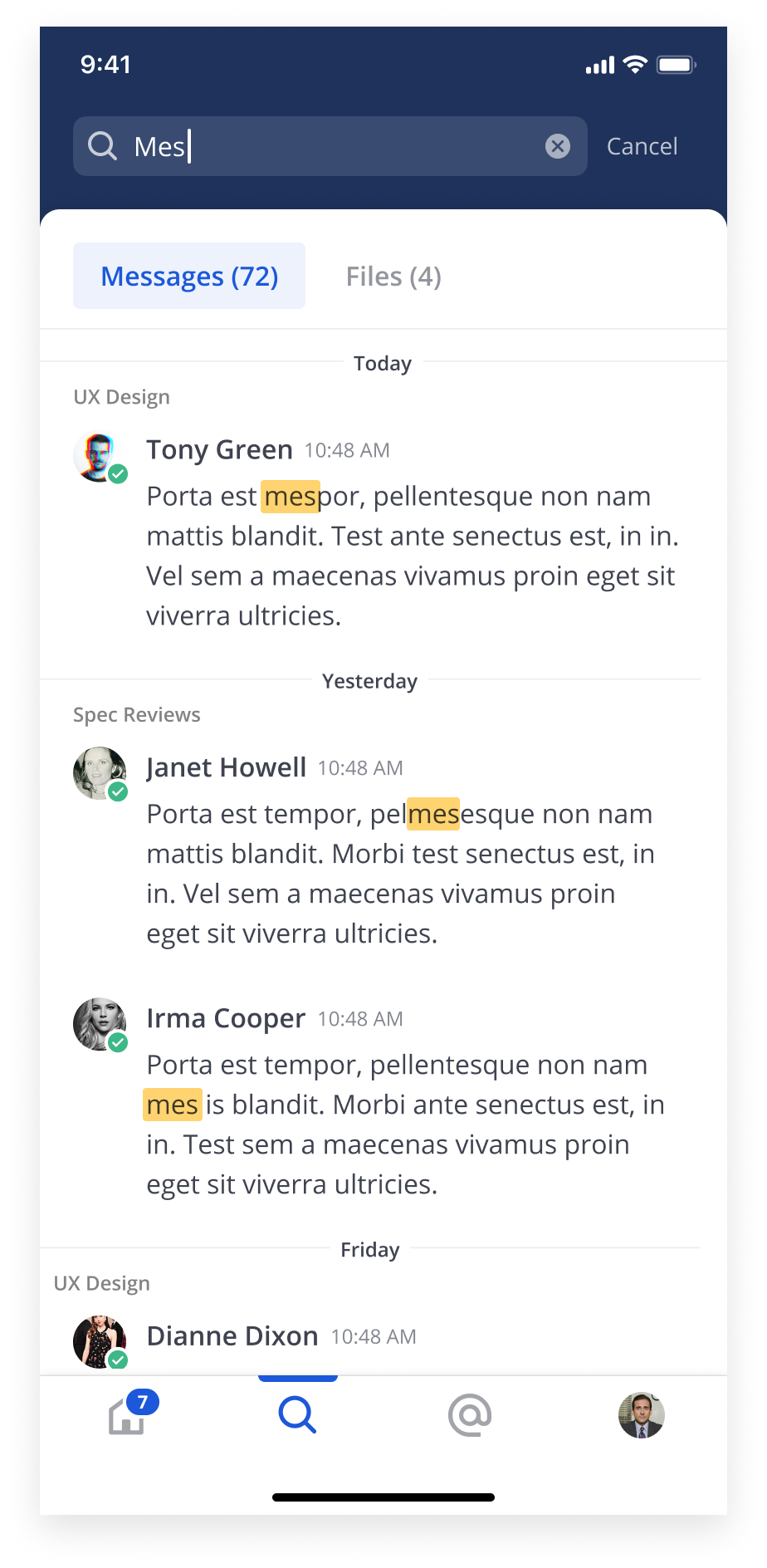
Results
Search keywords are highlighted within the results.
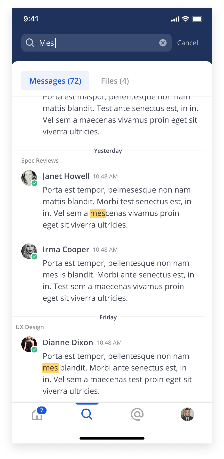
Scrolled
Tabs are sticky on scroll.
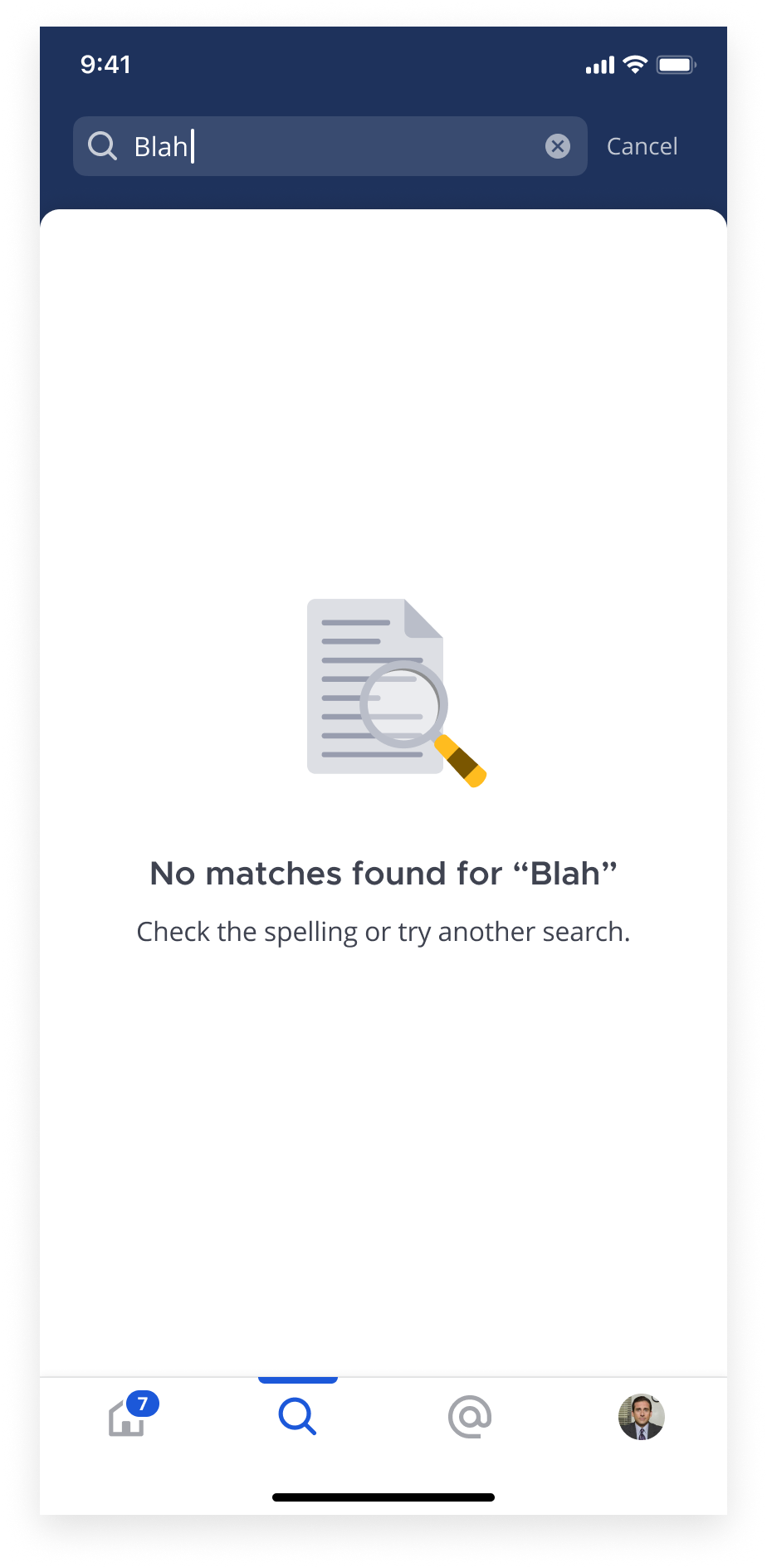
Empty State
If there are no results based on the search term, an empty state is displayed.
Tablet Layout

